Figures from the paper
Six of the paper's fifteen figures are photographs, schematics and simulation snapshots rather than data charts.1 The dashboards stand in for the data charts — but these six explain what the dashboards are of: what the model is, what it measures, and what the measurements look like in a real earthquake. Each one below notes where it turns up in the interactive views.
How these figures may be reused
They are reproduced from the accepted manuscript of:
Chiama, K., Bednarz, W., Moss, R., Plesch, A., and Shaw, J. H., "Quantifying relationships between fault parameters and rupture characteristics associated with thrust and reverse fault earthquakes", Earthquake Spectra (41:5), pp. 3977–4014. Copyright © 2025 (The Author(s)). DOI: 10.1177/87552930251346434
You may reuse them for non-commercial purposes, without modification, keeping that citation with them. These terms are narrower than the rest of the site, where the text is CC BY 4.0 and the code Apache-2.0 — see the repository. Photographs inside Figures 1 and 2 are credited on the figures to the publications they came from, and belong to those authors.
Figure 1 — what surface rupture does
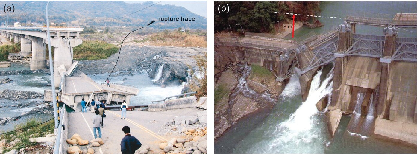
Coseismic thrust-fault displacement during the 1999 M 7.6 Chi-Chi earthquake in Taiwan: an offset river along the Chelungpu fault that brought down a bridge, and the Shih-Kang Dam broken by roughly 8 m of uplift on the same fault.
This is the thing the dashboards measure. Every scarp height plotted on this site is the height of a step like the one under that bridge, and every deformation zone width is how far the ground was disturbed either side of it. The reason the study asks how large those get is that pipelines, roads and dams have to be built across them.
Figure 2 — the six scarp classes
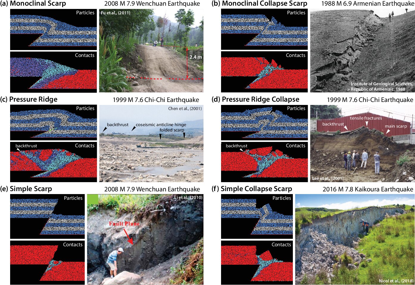
Each panel pairs the model's own output — as particles, and as the contact bonds between them — with a photograph of the same morphology after a real earthquake: monoclinal, pressure ridge, simple, and a collapse variant of each.
That pairing is the argument the whole site rests on: the shapes the simulation produces are shapes that occur in the field. It is also the practical key to the dashboards, because these six classes are the colour legend on Model vs reality, Distributions and the model panels of Per-event boxplots. When a legend entry means nothing to you, this is the figure to look at.
Figure 3 — what a simulation actually is
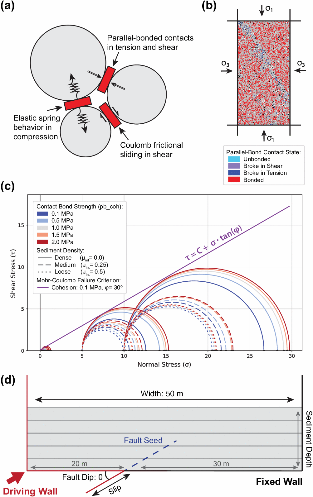
The distinct element method treats sediment as many discrete particles bonded where they touch. Those bonds act as springs in compression and break under tension or shear (a); their collective strength is calibrated against biaxial tests (b) onto a Mohr-Coulomb failure criterion (c). Panel (d) is one experiment: a 50 m box of sediment, a fault seeded at a chosen dip, and a driving wall pushed until the surface above deforms.
Panel (d) is worth a second look, because its labels are the dashboard controls. The angle θ is the fault dip you filter by everywhere, and the slip along that plane is the x-axis of Response curves and the quantity Slip regression works backwards to.
Figure 4 — the sediment configurations
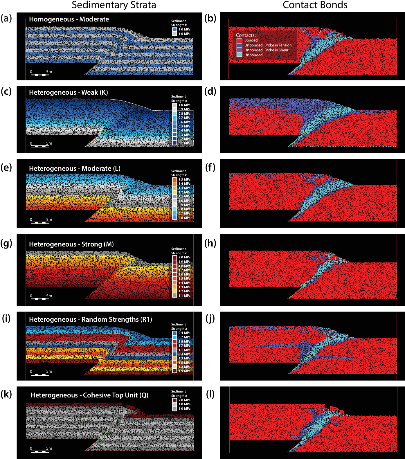
The same experiment through six sediment set-ups, each shown as strata (left) and as contact bonds (right): homogeneous moderate strength, then heterogeneous weak, moderate, strong, randomly assigned strengths, and a cohesive unit over weaker material.
The lettered codes — K, L, M, R1, Q — are the DEM sets
in the data. So when you change Condition By to Set or
Sediment_Strength on Response curves,
or colour the cloud by set on
Model vs reality, this figure is what
the categories mean.
Figure 5 — the quantities every dashboard plots
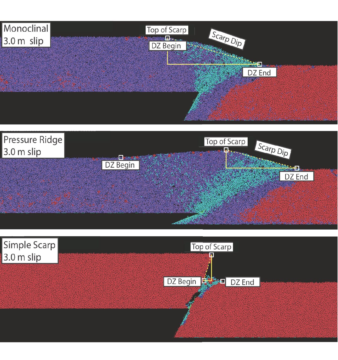
For each scarp type, the computer-vision model locates four things: the top of the scarp, where the deformation zone begins, where it ends, and the angle of the scarp face.
Those four picks are the entire measurement vocabulary of this site. Scarp height is the first, deformation zone width is the span between the second and third, and scarp dip is the fourth. Every axis on every dashboard traces back to this figure — which makes it the one to read first if the terminology is new.
Figure 7 — why the layering matters
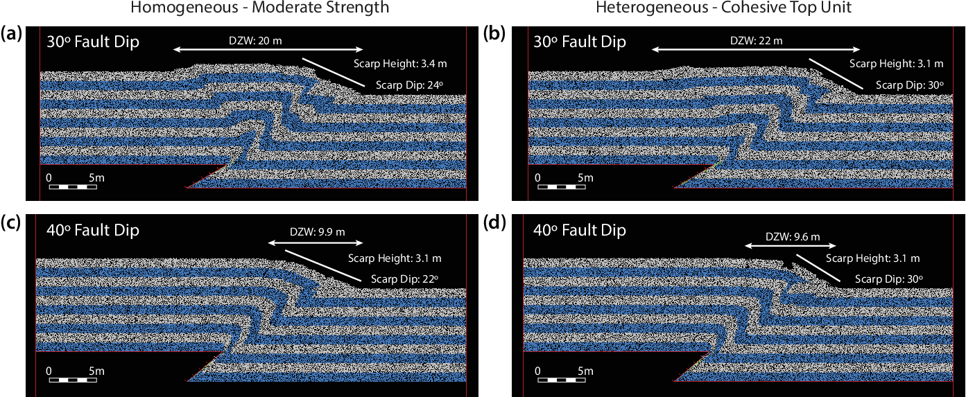
Homogeneous moderate-strength sediment beside a heterogeneous case with a cohesive unit above weaker material, at 5 m of slip on 30° and 40° faults.
The comparison makes a point that is easy to miss in a scatter plot: the same slip on the same dip does not produce the same surface. What the rupture travels through matters as much as how far it moves — which is why sediment strength and layering are controls on Response curves and Distributions rather than fixed assumptions.
Where to go next
- The paper — the figure-by-figure crosswalk, and which dashboard replaces each data chart.
- Glossary — the vocabulary these figures use.
- Model vs reality — the simulations and the field measurements on one canvas.
Please cite as:
Chiama, K., Bednarz, W., Moss, R., Plesch, A., and Shaw, J. H. (2025). "Quantifying relationships between fault parameters and rupture characteristics associated with thrust and reverse fault earthquakes." Earthquake Spectra, 41(5), 3977–4014. DOI: 10.1177/87552930251346434
If you use the underlying data itself, cite the archives it comes from as well — the DEM experiments are deposited open-access on DesignSafe-CI, and the field compilations carry their own citations. The full list, with DOIs, is under How to cite this data.
Any DOI issued for this site or its source code identifies the software and the website, and does not replace the citations above.
Related work, for the wider project's 3D models — not a source for anything shown here:
Chiama, K., Plesch, A., and Shaw, J. H. (2025). "Along-Strike Variability of Surface Deformation on Thrust and Reverse Fault Ruptures: Insights from 3D Distinct Element Method Models." Seismological Research Letters 96(6), 3473–3489. DOI: 10.1785/0220250173
-
notes/chart-families.mdin the source repository — the figure-by-figure inventory separating the paper's data charts from its illustrations. ↩